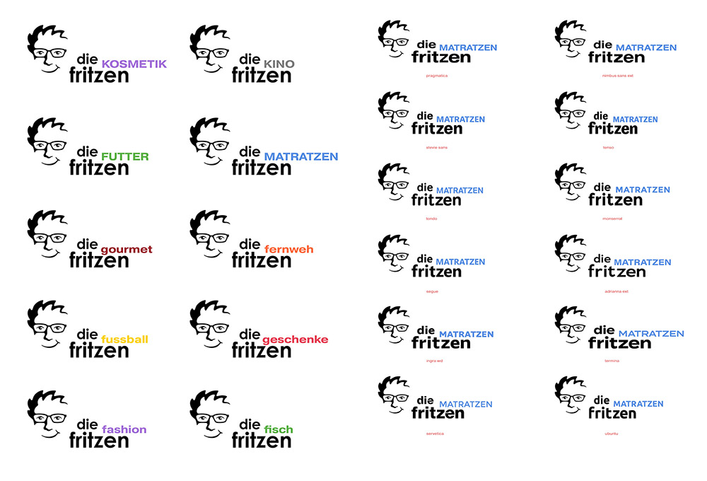
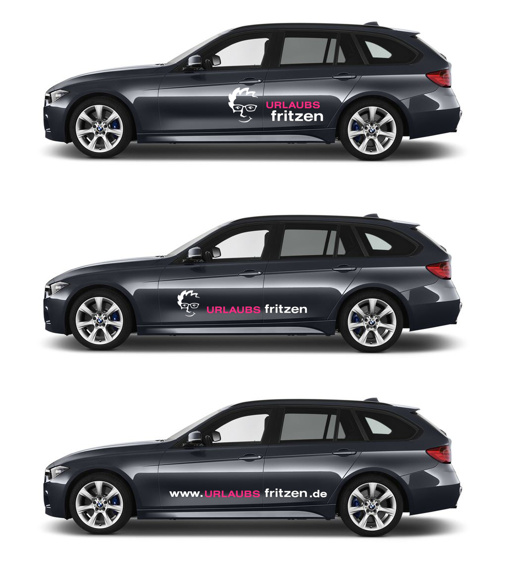


For our website “Urlaubsfritzen” I developed the corresponding logo a few years ago. The Fritzen-head was the most complicated element, because it should also transport the mood and attitude of the brand. The planned further “undertakings” under the Fritzen brand were in the luxury as well as the consumer sector. Thus the face of the brand had to appear cheeky, competent, modern and serious at the same time. The typography also went through the usual iterations until the final result. Finally, the article was rationalized away. As “proof of concept” how versatile the logo can be used… a car lettering, which was implemented like shown here.